

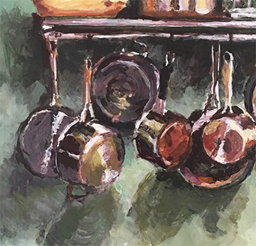
Pots ‘n Pans, 12″ x 14″, Acrylic on masonite panel
At the beginning of the year, I set myself the goal of completing one actual painting each month. I’m still pretty new to painting and am learning as I go, so I set this arbitrary goal to help myself stay motivated. Anyway, this is my piece for November, 2023. It’s a scene from my kitchen – I suppose I’d call it a still life. I chose this as a subject because I liked the lights and darks of the pots, and the shadows that they cast. Shadows are tricky for me. What color is a shadow? In this painting I also did my usual amount of fussing in the planning stage, trying to decide which colors to use and how best to arrange the pots so they looked balanced. I’m pleased with the overall result: the colors seem to go well together, the composition looks balanced, and the shadows don’t look too obviously wrong.
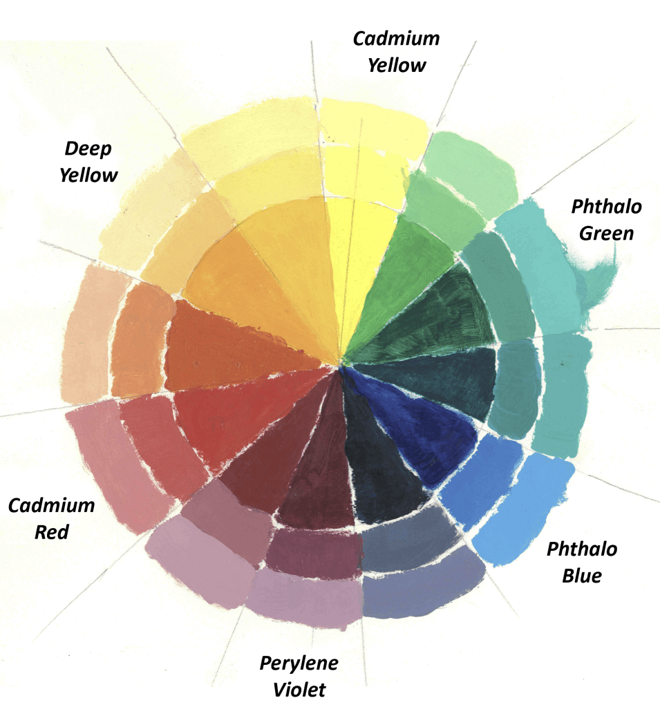
I begin all of my paintings by obsessing about which colors to use. For my basic palette, I have six colors that I get straight out of the tube: three primaries (Cad Red, Phthalo Blue, and Cad Yellow), and three secondary (Phthalo Green, Perylene Violet, and Deep Yellow). I also use a ton of Titanium White. Maybe white doesn’t count as a color, but it’s the paint that I use the most of.
For this painting, I initially limited myself to the color scheme shown below. Using too many colors straight out of the tube results in paintings that look garish and cartoonish. At least that’s been my experience. So I’m trying to use fewer colors. For the pots ‘n pans painting, I planned to stick to just four colors.
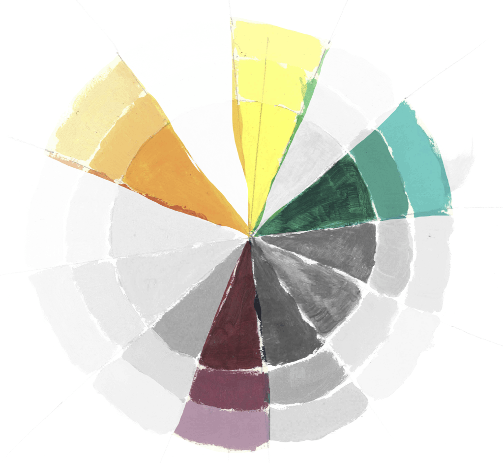
Orange, green, and violet are all secondary colors, and in my opinion they give a nice “less intense” look to a painting. Yellow is the complement to violet, so I thought it would work well. This is sort of a “split complement” palette. Using a split-complement color scheme like this a standard way of making sure the colors look okay together.
All good. But then, right at the finish, I added a splash of blue in the bottom right corner, thinking it would offset the orange pot in the upper right. I’m not sure this was a good idea. Does the blue distract from the rest of the painting, or does it provide a nice contrast to the orange? I can’t decide. And what happened to my decision to limit myself to only four colors? What can I say. Sometimes it’s good to stick to a plan, and sometimes it’s better to be spontaneous. I never know what a situation calls for.
Back to shadows: For darks, I’ve been avoiding black paint straight out of the tube. Instead, I mix my chosen colors until I get a very dark, muddy color. This is my “black”. I mix this with the other colors to try and get shadows. I think it turned out rather well in this painting, but it’s definitely something I’m still working on.
The final painting is a bit more impressionistic than I had intended, but I rather like it.
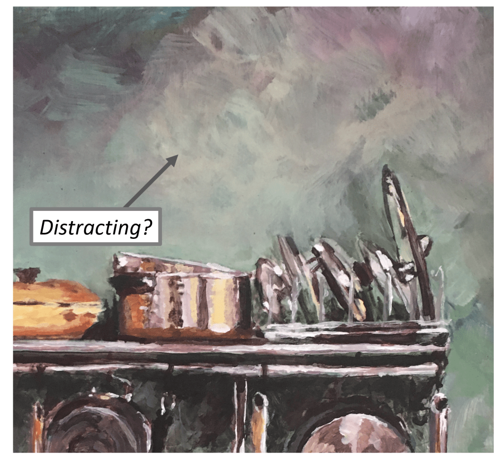
Aside from the blue dash in the bottom right, which I can’t decide about, there are a couple of things that I’m definitely not happy about. I think the light-colored region at the top center is a bit distracting. Like maybe the transition of colors is too abrupt. I don’t know, something about it looks goofy to me.
Also, I kind of effed up the finish when I was applying the final clear-coat varnish. Clearly this is something I still need to figure out.

Despite a couple of imperfections, I’m pleased with this painting. I think the colors work well together and that the composition looks balanced. And I’m pretty happy with the way the shadows turned out. There are a couple of things I would change, but overall, I’m calling November a success. 🙂

Leave a comment